Muhammad Shoaib Nadeem— Portfolio
Our Projects
Continue Next Page
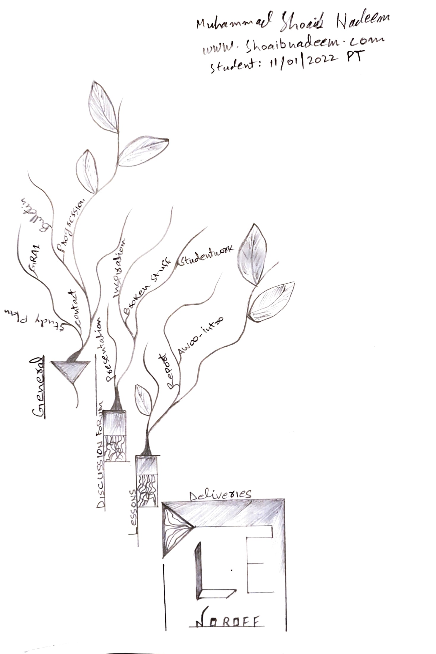
AW00: L.T 1.4 Moodle illustration
Brief:
Get to know Moodle as a work tool (8 hours)By now you might have noticed that Moodle is your “campus”. It forms the platform on which all your study material is delivered and it also enables you to talk to your fellow…
Introduction:
Making “Moodle Platform Illustration” LT 1.1 Using paper, pencil, Mobile Camera. Submit date 24 January 2022 Course is Graphic Designing and reflective journal website is https://shoaibnadeem.com
Concept / idea:
Concept is simple and very genuine without any complexity; I use Moodle words as a planted port which is growing in bushes some of bush’s shows a written words and some showing leaf on it and in the bottom of Illustration there is three words “DLE” which is in the form of HUB / Home and I represent these words as Noroff School where everything is connected.
Strategic Design:
If I try to explain my design then it has a very natural thought, it comes in my mind when I was lost that how I portrait my thinking on paper in easy way, this design is not 100% of my output because of my drawing is not good to enhance my thoughts.
I found a easy way which I can draw, this is first and last Design in my mind so I feel to Draw on paper.
Inspirations:
I will freely say that I am inspired with plants, everyone knows first we seed and it grows after that we take care and gave it special attention to take advantage from certain plant in different ways.
Typography and colors:
I use my own typography and create words somehow, I use Port shape for plants (For Example) https://no.pinterest.com/pin/308989224407279341/ and it has no color just using black pencil.
Composition, Layout, Grid:
In this layout I use very deep design like if you notice in the first four leters “MOOD” they all are different and in the “MOO” the roots are visible to convey the thought, and layout starts from top to bottom and gradually spread in the bottom and it shows shape of home with random spacing according to need.
AW01 - Module 1: Idea Development
Task 1.1 Lateral thinking
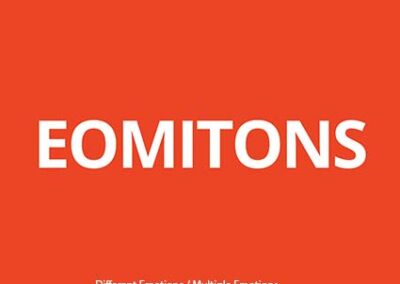
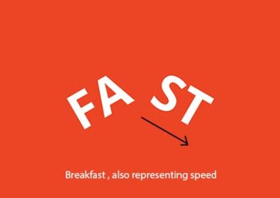
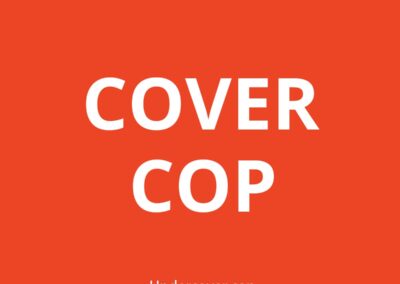
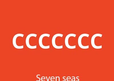
Lateral thinking is an indirect and creative approach to problem solving. It is not the traditional approach, whereby step-by-step logic is used. It’s moving beyond the obvious or expected, using your imagination to look at a problem in a new way, for a fresh solution.
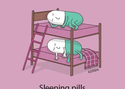
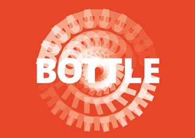
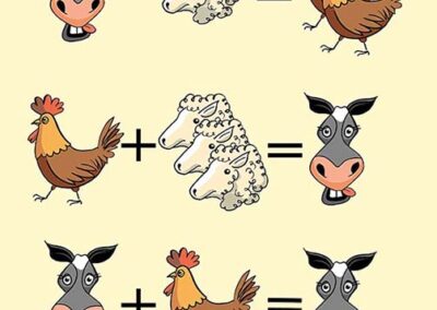
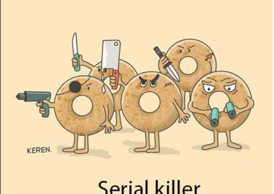
Look at the following and guess what they are communicating. Just for fun, see if you can make one or more of your own.
You can use whichever medium you prefer, the objective of this task is not the final artwork, it’s just to get you thinking laterally.
Task 1.2 Ideation
Brief:
Ideation is the creative process of creating new ideas. There are various ideation techniques out there; mind mapping, brainstorming and sketching, to name a few. Use the Internet for research and choose three that you would like to try in the future or have use before. Describe how they work in no less than a paragraph. Optional: Add examples or visuals. Just remember to add the source.
Storyboard
Stories are a key medium for communication, learning, and exploring. Storyboarding is all about developing a visual story relating to the problem, design, or solution which you want to explain or explore. Storyboarding can help you bring a situation to life, it can show what happens over time, and explore the dynamics of a situation. You can use storyboarding after having empathised with people in order to better understand their lives. You can draw out their stories. Storyboards can help you represent information you gain during research. Create scenarios consisting of pictures and quotes from users. If you are developing ideas, you may then seek to play with different scenarios to see where they go. Develop a coherent storyline with actors and a plot. Try to build tension and include unexpected surprises in your story. Evoke emotions and show struggle and by the end learning and solving the tensions and leaving the user satisfied.
When you’re creating your storyboard you can seek inspiration in the method called “Aristotle’s seven elements of good storytelling” which you can download, print and use as your guide.
Worst Possible Idea
Worst Possible Idea is a highly effective method that you can use to get the creative juices flowing and help those who are not so confident in expressing themselves by flipping the brainstorm on its head. It’s a lot of fun too. Instead of going for good ideas and putting the pressure on, call for the worst possible ideas your team can come up with. Doing this relieves any anxiety and self-confidence issues and allows people to be more playful and adventurous, as they know their ideas are most certainly not going to be scrutinised for missing the mark. It’s way easier to say, “hey, no that’s not bad enough” than the opposite. A great variation of this called the bad ideas method encourages you to generate a large quantity of bad ideas.
Movement
The movement technique will also help you if you’re blocked in your idea generation. You can use this technique to step around the roadblocks in your thinking. As the Provocation technique Movement will help you force your team to question the status quo, shock yourself and your team into a new reality. This is the perfect “what if?” tool. Lateral thinking techniques do not always immediately result in concrete or usable ideas, but create a wide array of thinking stimuli, which you can leverage for piecing together practical ideas. To make use of the stimuli generated, it requires movement, or what some refer to as insight or principle mining. This tool will help you spot themes, principles, useful attributes or trends in your thinking, which you can use to build up a more viable and realistic ideas.
Ideation Example taken website
Hero Image: Author/Copyright holder: Braden Kowitz. Copyright terms and licence: CC BY-SA 2.0
Task 1.3
SCAMPER packaging
Brief:
Apply each one of the SCAMPER techniques and do a write‑up on your findings. Then choose the option you think would work best and sketch what the packaging would look like.
The SCAMPER Method For Understanding.
Alex Osborn, a pioneer teacher of creativity first identified the nine principle ways of manipulating a subject. Bob Eberle later arranged them into the SCAMPER method:
Substitute something
Combine it with something else
Adapt something to it
Modify or Magnify it
Put to other uses
Eliminate something
Reverse or Rearrange it
Suppose you wanted to improve ordinary metal paper clips. You could substitute metal for plastic and add colour. Your plastic clips could then be used to colour‑code documents, thereby putting the paper clips to another use.
As you explore the SCAMPER method, you should remember that creativity has a lot to do with asking the right questions. Even the hot dog, as we know it, is the result of asking the right question at the right time.
In 1904, Antoine Feuchtwanger was selling sausages at the Louisiana Exposition. His customers complained because the sausages were very hot and burned their fingers. Antoine served the sausages on individual plates to solve this problem, but this proved to be too expensive. He then offered his customers white cotton gloves, but the gloves were also expensive, and customers walked off with them.
Antoine and his brother‑in‑law, a baker, sat down to figure out what inexpensive item could be added (modify) to the frankfurters to prevent people from burning their fingers. His brother‑in‑law said, “What if I baked a long bun and slit it to hold the frank? Then you can sell the franks, and I can sell you the buns. Who knows; it might catch on”.
Other examples are sometimes surprising, unexpected and inspirational.
It’s often easy to create a new idea by simply adding something to your subject. Computer and cell phone manufacturers are constantly adding more features and greater speed to their products. Another example is gas stations that also sell groceries and fast food.
At one time, the Ford Motor Company controlled 60% of the automobile market. Then General Motors asked questions about modification and came out with a philosophy that stated, “A car with every shape and colour for every purse and purpose”. Henry Ford responded with, “Any customer can have a car painted any colour, as long as it is black”. Ford’s sales slumped soon after.
If you can get rid of your preconceptions and look at your subject with fresh eyes, you will begin to imagine what else you could do with it. This kind of thinking turned a failed product into 3M’s biggest consumer success.
The company had developed a special not‑very‑sticky adhesive for bulletin boards, a product idea that never caught on. Arthur Fry, a 3M chemist, was intrigued by the glue and kept searching for other uses. In 1974, Fry was singing in his church choir and dropped the bookmark from his hymnal. He suddenly realized that the adhesive could be used to keep little notes and bookmarks in place.
This creative insight (that the glue’s primary use should be attaching paper to paper) gave us the Post‑it.
Task 1.3 SCAMPER Pack By Muhammad Shoaib Nadeem
Task 1.3 SCAMPER Packaging by Muhammad Shoaib Nadeem
Muhammad Shoaib Nadeem –PT 11 January 2022
At the start, we have to understand the SCAMPER technique!
What is it and who invented it, I personally do some research:
Who Invent SCAMPER? What is SCAMPER?
Bob Eberle, an author of books on creativity for young people, introduced the SCAMPER mnemonic in 1971 in his book Scamper: Games for Imagination Development. The technique draws heavily from the Idea Spurring Checklist developed by advertising executive Alex Osborn in the early 1950s.
SCAMPER helps you develop new products and services. Many of the questions it uses were created by Alex Osborn, but Bob Eberle developed the mnemonic. SCAMPER stands for Substitute.
Bob Eberle, an author of books on creativity for young people, introduced the SCAMPER mnemonic in 1971 in his book Scamper: Games for Imagination Development. The technique draws heavily from the Idea Spurring Checklist developed by advertising executive Alex Osborn in the early 1950s.
My personal Thought / Opinion
So now you know that this is a person / human thought, so anyone can change it and modify it according to need, but in a specific situation I am stuck in certain boundaries and lack of time I am in hurry, I will write more clearly about this technique later.
Normally company’s using standard cardboard, hard paper or plastic paper to make bulb packing that is understandable because these all companies are very big and have several year experiences they have their own designers’ team, they can do whatever they want.
Substitute something
Combine it with something else
Adapt something to it
Modify or Magnify it
Put to other uses
Eliminate something
Reverse or Rearrange it
Substitute:
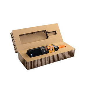
The material normally used is plastic and cardboard but we can use both on Bulb packing.
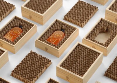
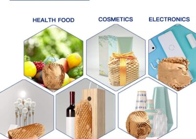
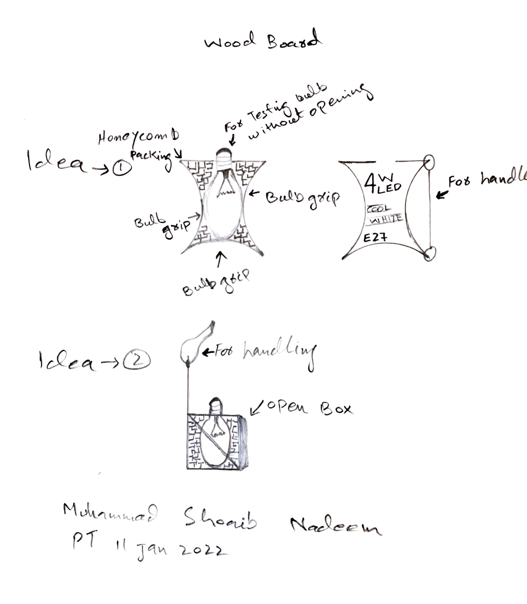
In my case I’m using wooden board Honeycomb packing-which is safer for product
Combine:
I’m using wood board + honeycomb + plastic in this idea front side is open
with transparent plastic and backside covered with a wood board.
Adapt:
I adopt easily to carry Both sides are pressed and very easy to carry with extra handling ribbon.
Modify or Magnify:
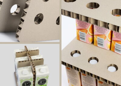
I just modify this packing with honeycomb filling.
Put to other uses:
Take out the filling and use it for other purposes just like example.
Eliminate something:
Just take out filling and use it as a lamp hanging on the roof or you can use it as a jewelry box.
Reverse or Rearrange:
Color the box decorate it and put it on your table so many things can be done.
AW02 Task 2.1 Scamps
Brief:
Final Result
Task 2.2 Scamper Technique
Brief
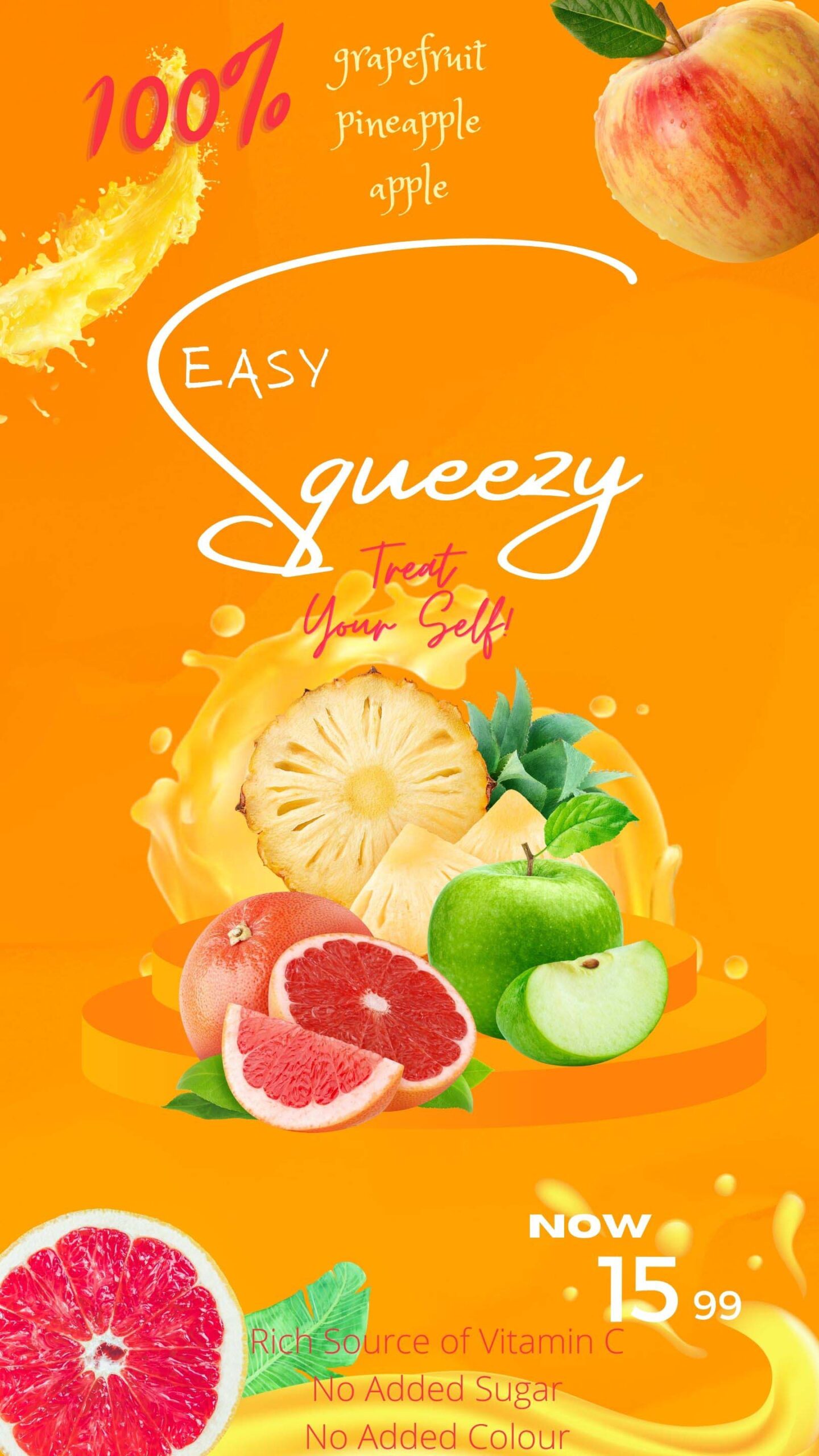
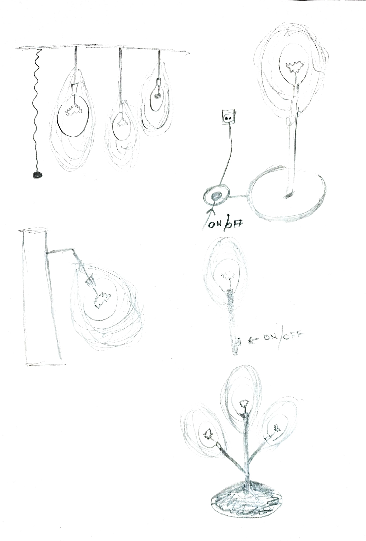
I’m using SCAMPER techniques on Whisk and making it a new product.
Substitute something
Combine it with something else
Adapt something to it
Modify or Magnify it
Put to other uses
Eliminate something
Reverse or Rearrange it
In my research, I found so many types of a whisk, all they have different purposes on different occasions according to the user’s need.
Well so I sketched many types of whisk but I really want to be sure that my whisk should be useful in the real world which was really hard for me.
I made finally a “Whisk Lamp” which can be used as a Floor Lamp, Pendant Lamp, Roof Lamp.
Anyone can easily use it in their home for decoration Light in the kitchen, living room, bedroom, etc.
This new product can be sold on online stores like Amazone, eBay, E-commerce store, and physical store.
Task 2.3 History of graphic design
In the lesson, we looked at some articles that focus on key events in the past century that have impacted modern graphic design.
Choose five of these key events and do more research on each.
In your own words, using the extra knowledge you have gained in your research, write a paragraph about each, explaining what impact it had on graphic design. Include visual examples if you have.
A Timeline of Events That Shaped Modern Design
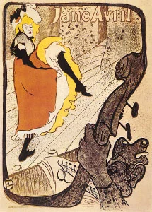
Graphic design has a long and interesting history and it all began with the first words and pictures. From early developments in printing to the emergence of distinct styles in design during the 20th century, let’s take a look at the major events and movements that shaped graphic design.
EARLY INNOVATIONS IN VISUAL COMMUNICATION AND PRINTING
15,000 – 10,000 BC: The first known visual communication, with pictographs and symbols in the Lascaux caves in southern France.
3600 BC: The Blau Monument is considered to be the oldest artifact known to combine words and pictures. They are thought to be from the Iraq area.
105 AD: Chinese government official Ts’ai Lun is credited with inventing paper.
1045 AD: Pi Sheng, a Chinese alchemist, invents movable type, which allows characters to be individually placed for printing.
1276: Printing arrives in Europe with a paper mill in Fabriano, Italy.
1450: Johann Gensfleisch zum Gutenburg is credited with perfecting the system for printing type in books.
1460: Albrecht Pfister becomes the first to add illustrations to a printed book.
REVOLUTIONARY CHANGES TO TYPEFACE
1470: Nicolas Jenson, considered one of history’s greatest typeface designers, sets news standard for the Roman type.
1530: Claude Garamond opens the first type foundry, developing and selling fonts to printers.
1722: The first Caslon Old Style font is developed. It would later be used for the printing of the Declaration of Independence.
THE INDUSTRIAL REVOLUTION
1760: The Industrial Revolution begins and sets the stage for advances in graphic design production.
1796: Author Aloys Senefelder develops lithography. This was the first “planographic” printing method employed, meaning it used a flat surface and set the stage for modern offset printing.
1800: Lord Stanhope invents the first printing press made of all cast-iron parts. It required one-tenth of the manual labor of previous presses and doubled the possible paper size.
1816: The first sans-serif font makes a subtle entrance as one line of a book.
DESIGN COMES INTO ITS OWN
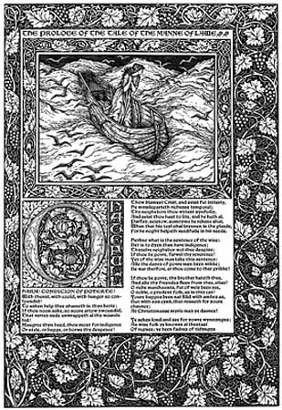
1861: Williams Morris, who became a highly influential figure in design history, sets up his art decorating firm. He was a major player in the British Arts and Crafts Movement.
1869: N.W. Ayer & Son is founded. Considered the first advertising agency, they pioneered the open contract and utilized fine art in design.
1880: The development of halftone screen allows for the first photo to be printed with a full range of tones.
1890: The Art Nouveau movement begins and it changes design forever. It made its way into all types of commercial design and utilized all types of arts. The style continued through 1920.
MODERN DESIGN STYLES EMERGE
1900: The Futurism style of design emerges. Influenced by cubism and technology, it dropped all the traditional features and concentrated on clean, sharp, straight lines. It was popular through the 1930s.
1910: A style called Early Modern developed. It uses photos rather than illustrations and a minimalistic, geometric design sense.
The style was popular until around 1935.
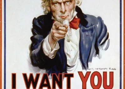
1910: Hero Realism is influenced by the wars and continues through the 1940s. This style relied heavily on realistic illustrations of people and a strong message: think Rosie the Riveter.
1919: Bauhaus opens. The German design school quickly became the powerhouse of modern design, often employing Art Deco and what would become the Swiss styles.
1920: Art Deco graphic design, with its bold geometrics and high contrast emerges alongside the fine art. It lacks the depth of other styles and is used through the Roaring Twenties and into the 40s.
STYLES CLOSELY FOLLOW POP CULTURE
1932: The Times New Roman typeface is created by Stanley Morrison. It was commissioned by the “Times of London.”
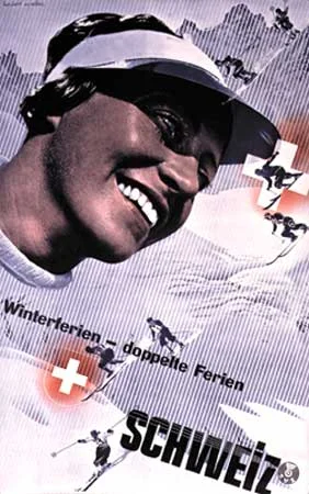
1940: Negative space and clean designs formulated the Swiss style of design.
Sans serif fonts and asymmetrical layouts were often preferred. It had a long popularity and was seen often until the 1980s.
1945: The Late Modern movement arises and follows up on the geometrics of Art Deco. This style is informal and drops conventional layouts. It was common through the 1960s.
1947: Legendary graphic designer Paul Rand releases his first book, “Thoughts on Design.” His work would influence every modern designer to come after him.
1950: Kitsch emerges and becomes most notable in the often overdramatic movie posters of the day. High contrast and bold colors, fantastic imagery, and illustrations of dramatically posed people were common in this style.
1957: Helvetica is developed by Max Miedinger. It rapidly became a popular and standard typeface.
1959: The first issue of “Communication Arts” is released. This design magazine would quickly become an industry standard and features the best work of modern designers.
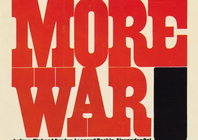
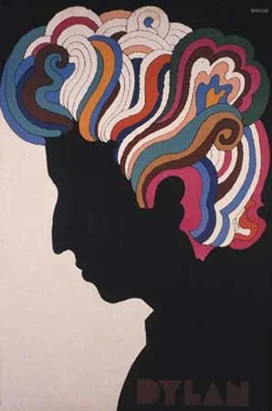
1968: Inspired by hallucinations, the Psychedelic style emerges and plays to the counter culture. Swirls, obscure fonts transformed into shapes, and bright colors permeated the often hard-to-read designs.
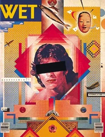
1970: Illustrations that revolved around collage became popular in the Post-Modern movement. The overlaid elements and impulsive feel was common through the 80s.
THE DIGITAL REVOLUTION
1990: The first version of Adobe Photoshop is released, creating a revolution in the way graphic designers work.
2000: Grunge design emerged along with the punk rock scene as more designs used texture to portray a dirty feeling. This style remained popular through the 2010s.
2010: What became known as the Flat style plays off the minimalist feel with sharp lines and surprising twists like the excessive use of negative space.
2016: Abstract Swiss continues the minimalist trend, distorting and deconstructing design in ways that seem random.
2017: Cinemagraphs emerge — photographs where one small movement is made — to grab viewers’ attention in the clutter of on-screen marketing.
EVERY IMAGE HAS A STORY
Task 3.1 Expressing meaning
AW02 – Module 2: Sketching Techniques
Brief
Question 1
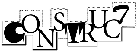
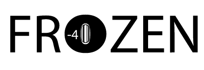
Create three different typographic compositions, showcasing your three words, one word per composition. In each composition, arrange each word to express its meaning, using only black and white. Consider all and any means at your disposal: dramatic scale contrasts, cutting, repetition, letter spacing, etc. Make sure only to use one typeface for each composition, noting the suitability of the choice of typeface to the individual word; you can experiment with various styles (light, bold, condensed, uppercase, lowercase). You may repeat, omit, slice, block or overlap words or letters.
Question 2
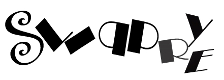
Create a new word, one which has no dictionary definition and meaning that you made up. Then follow the same process as question 1 and create a composition using typography, to showcase and express the meaning of your word. For example, the word we came up with is ‘roleean’, it doesn’t appear in the dictionary, but it means ’round and leaning to the left’. When expressing the meaning of this new word, it might involve emphasising or dramatically enlarging the letter ‘o’ within the word and using italics, allowing the letter to lean to the side.
Optional: You can use a programme such as InDesign or Illustrator to rework and refine the designs if you have the time to get some practice with the software. Please don’t use drop shadows or similar computer-generated effects.
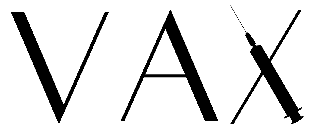
Short for vaccination, this expression has been widely used in 2017, the year when the so-called anti-vaxxers have finally exhausted the patience of many governments in Europe and around the world, who have started fining those irresponsible parents who decide not to vaccinate their children.
Using unfounded and outlandish arguments such as the one in the gif above (“vaccines cause autism in children”), the anti-vax movement is behind the recent outbreak of diseases such as measles, mumps or polio in many countries who had successfully managed to eradicate them long ago.
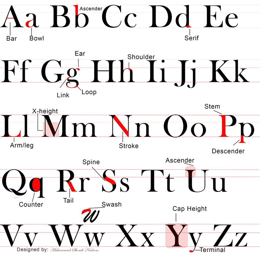
Task 3.2 The anatomy of type
Using colour, show each of the following on the alphabet:
You can experiment with the design as long as the visual message is clearly expressed to the viewer.
The format should be 210 x 210 mm square.
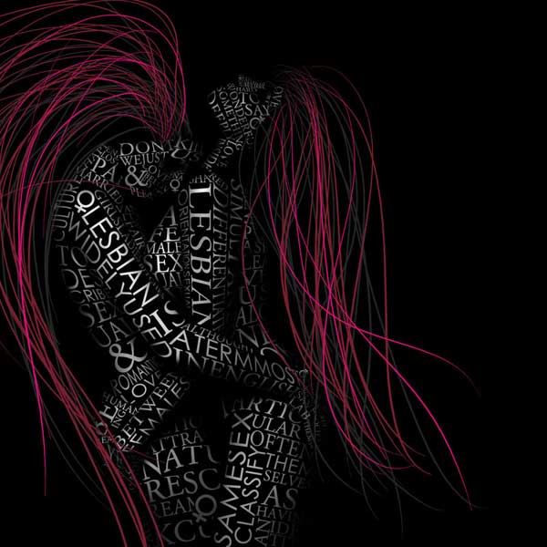
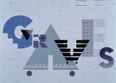
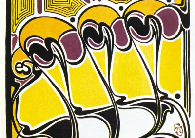
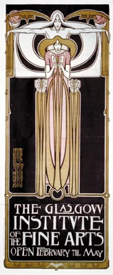
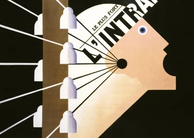
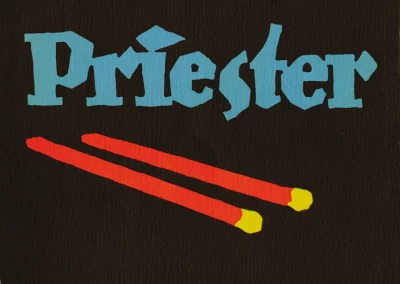
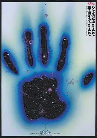
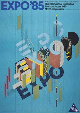
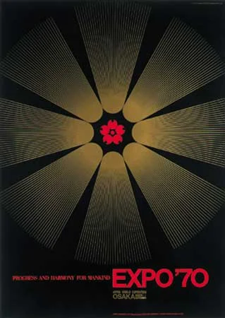
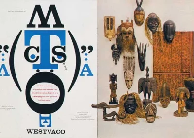
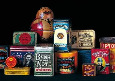
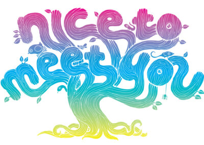
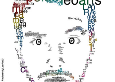
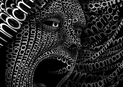
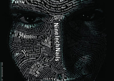
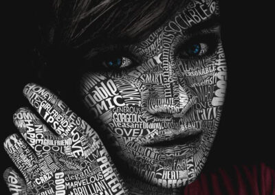
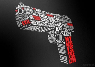
Excellent typography designs that inspire
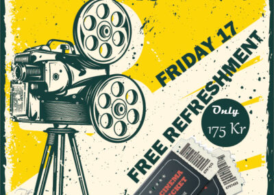
Task 3.3 Designing a film festival poster & pamphlet
-
Design a poster for a film festival. You can decide on the name and remember to include the date and the venue. Focus on strong and expressive typography. You are allowed to add visuals. Use an A3 format at 297 x 420mm.
-
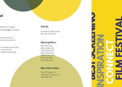
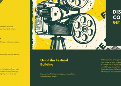
Expand your design to include a pamphlet that outlines dates and further details of the festival. Remember this design must be consistent with your poster design. The pamphlet can be any size or format. Have a look online for inspiration.
Task 4.1 Colour theory
Question 1: Research and written
Question 1 Part 1
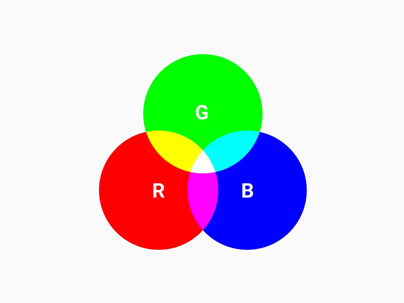
The RGB color is one of the most well-known color systems in the world, As an additive color system, it combines red, green, and blue light to create the colors we see on our TV screens, computer monitors, and smartphones. can be combined in various proportions to obtain any color in the visible spectrum.
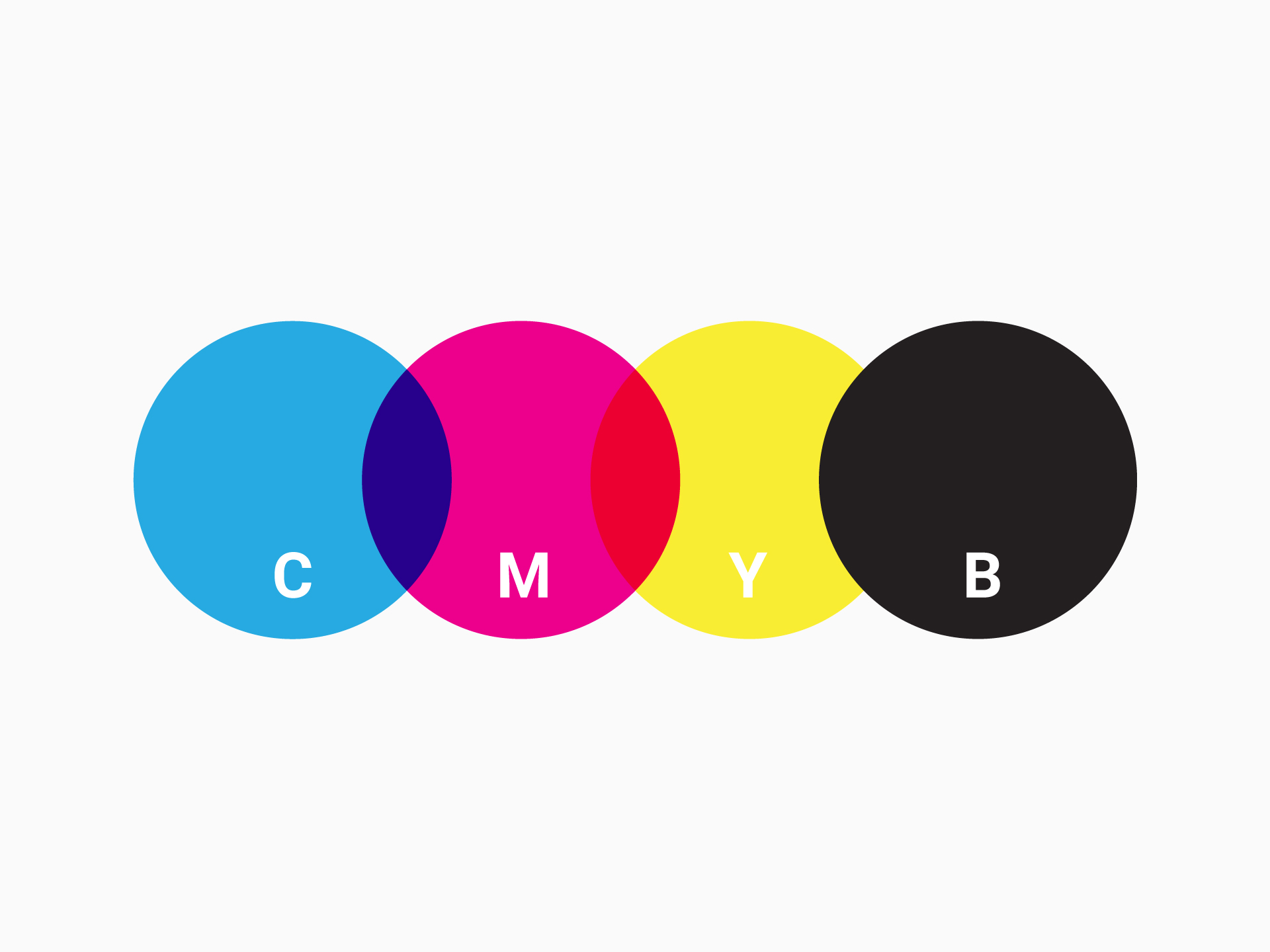
CMYK stands for Cyan, Magenta, Yellow, and Key. The CMYK color system works by applying blends of the four colors, in printed ink, to create the right color, shade, and hue for designs when they’re printed. It’s as simple as blending the right combination of colors to create the desired result.
Continue Next Page
Let’s Start A Project
Office
Norway
